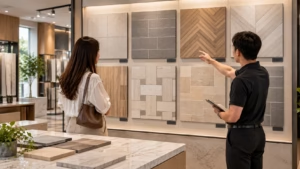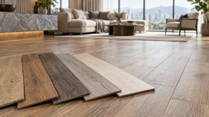
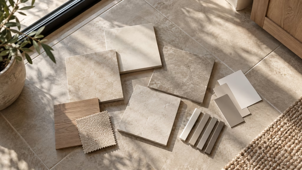
A tile can look noticeably different at home than it did in the showroom, and this is generally expected rather than a sign of a faulty product. Lighting, sample size, shade variation, grout colour, and the surrounding room all affect how a tile reads once installed. Judging a tile properly means testing it in your own space, not just under showroom spotlights. Always check the specifications and shade variation classification before you specify a tile for a full floor or wall.
Why Tiles Look Different Once Installed
A tile can look different at home from how it appeared in the showroom, and this is often due to differences in lighting, scale and surrounding finishes. Understanding these factors helps buyers judge tiles design more accurately before ordering.
- Lighting differences. Showroom lighting and home daylight can make colour appear different.
- Scale effect. A small sample reads differently than the same tone spread across an entire room.
- Context shift. Walls, furniture and adjoining floors change how a tile’s undertone appears.
- Batch variation. Tiles from different production runs may show slight tonal differences.
Each is covered below, so you can judge a tile with realistic expectations rather than being surprised once it is laid.
Showroom Lighting vs Home Lighting
Showrooms commonly use controlled spotlighting with a warmer or cooler colour temperature than typical home lighting, which can make a tile appear brighter, greyer, or warmer than it will at home. Malaysian homes often rely on a mix of daylight through windows and ceiling lighting, both of which behave differently from a retail display.
- Colour temperature. Warm-white showroom bulbs can make a grey tile appear beige, while cool-white lighting can push the same tile toward blue-grey.
- Spot vs ambient light. Focused spotlights highlight texture and sheen more than the diffused lighting typical of a living room or kitchen.
- Daylight through windows. Malaysia’s strong tropical daylight changes through the day, so a tile near a window may look different at noon compared to morning or evening.
Because lighting has such a strong effect, viewing a physical tile sample at home, under your own lighting, is generally a more reliable step than judging colour from a showroom display alone.
Sample Size vs Installed Area
A small sample can under-represent how a tile will read across a full floor or wall, since colour intensity, pattern repetition, and shade variation become more visible at scale. What looks subtle on one piece can appear more pronounced once multiplied across a room.
- Colour saturation at scale. Darker or more saturated tones can feel heavier when repeated across a large floor than they do on a single sample.
- Pattern repetition. Textured or patterned designs may reveal a visible repeat once several pieces are laid side by side, which is not always apparent on one sample.
- Shade spread. A single sample cannot show the full range of tone variation within a batch, which is why the shade variation classification is a useful reference point.
- Practical fix. Requesting several samples, or a mock-up for feature areas, generally gives a more realistic impression than one piece alone.
If a design leans toward strong colour or high contrast, it is worth reviewing more than one sample before committing to full-area coverage.
Shade Variation: Why Piece-to-Piece Difference Can Be Intended
Tiles are supplied with a shade variation classification, typically recorded in the tile specification and shown on the product data sheet, indicating how much piece-to-piece difference is intended in the design. This is commonly written as a V rating, and it ranges from close to uniform through to a substantial difference between pieces.
- A design feature, not a fault. A higher classification is an intended part of the design, generally used for stone-look designs that mimic natural materials such as marble or concrete, rather than a sign of inconsistency.
- Depends on the look and the area. The classification to choose generally depends on the look intended and the size of the area being tiled; buyers who prefer a very uniform floor should check this early.
- Batch blending. Installers commonly mix tiles from several boxes during laying so variation is distributed evenly rather than clustered in one area.
- Checking before ordering. The classification is generally noted on the product data sheet or packaging, and can be confirmed with your supplier before ordering.
Is It Normal Variation or a Problem?
When an installed floor looks less even than expected, a few checks generally help determine whether the difference is normal design variation or worth raising with the supplier or installer.
- Check the classification first. Compare what is being seen against the shade variation classification stated on the product data sheet, since some spread between pieces is expected at higher classifications.
- Compare against the approved sample. Judging against the actual sample or mock-up approved earlier is generally more reliable than judging from memory of the showroom display.
- Check for multiple batches. Confirm whether more than one production batch, sometimes also called a dye lot, was used across the area, since batch-to-batch difference is a separate issue from intended shade variation.
- Separate the issue type. Surface damage, calibration differences and lippage are separate issues from intended shade variation and should be assessed with the supplier or installer.
- Raise it early. Flagging a concern with the supplier and installer before the remainder of the floor is laid is generally far easier to resolve than addressing it after the whole area is complete.
Where doubt remains, checking with the project consultant or installer before proceeding is generally the more reliable next step.
Production Batches and Why One Batch Matters
Tiles from different production runs may show slight differences in tone, even within the same product line, which is why a continuous area is generally best laid from a single batch. This is a separate consideration from shade variation within a batch, and both affect the finished look of a floor or wall.
- Batch numbers. Boxes are typically marked with a batch or lot number, and checking this before installation helps confirm consistency across the order.
- Ordering together. Tiles intended for one continuous area are commonly ordered together, with the batch reference checked against the delivery note before installation begins.
- Extra material. Ordering extra tiles upfront for cuts and repairs helps avoid sourcing a new batch that may not match exactly.
Confirming batch consistency before installation can help reduce the risk of noticeable tonal differences.
How Grout Colour Changes the Finished Look
Grout colour, covered in the Kimgres tile grout guide, could have a strong visual effect on how a tile design reads once installed, since it defines the visible joint lines across the entire surface. The same tile can appear quite different depending on whether the grout closely matches the tile or contrasts with it.
| Grout Approach | Visual Effect | Commonly Considered For |
| Matching grout | Less visually prominent joint lines | Large-format floors, minimalist designs |
| Contrasting grout | Defined grid pattern | Feature walls, patterned layouts |
| Light grout on dark tile | Highlights joint lines clearly | Decorative or mosaic-style layouts |
| Dark grout on light tile | Grid becomes a visible design element | Industrial or contemporary looks |
- Perceived tile size. Matching grout can make a floor appear more continuous, while contrasting grout breaks the surface into a visible grid.
- Maintenance appearance. Lighter grout may show soiling more visibly, though actual maintenance needs can vary by product and usage.
- Testing grout choice. Reviewing grout and tile samples together gives a more accurate preview of the finished look than viewing them separately.
Format, Layout and Viewing Angle
Tile format and the layout pattern chosen for installation both influence how a design is perceived, independent of the tile’s actual colour or texture. Big tiles and standard formats can produce quite different visual outcomes even when using the same base product.
- Format scale. Larger formats generally reduce the number of visible joints, creating a more continuous surface.
- Layout pattern. Straight lay, brick bond, herringbone and diagonal layouts each change how light and lines move across a floor.
- Viewing angle. A tile viewed straight down can look different from the same tile viewed at an angle while walking through a room.
- Room proportions. In smaller or narrow spaces,layout direction can influence how the room’s proportions are perceived, a factor covered in the guide to tile layouts for compact homes.
Some complaints about tiles “looking different” are actually about installation or product tolerance rather than colour at all, and these are worth separating out.
- Lippage. A height difference between the edges of adjacent tiles can catch light and read as an inconsistency even where the colour itself is uniform; this is a matter to raise with the installer.
- Calibration. Size differences between individual pieces can also affect how evenly a floor sits, and this is a separate matter from shade variation, best raised with the supplier or installer.
Because layout choices are made after the sample stage, it helps to visualise the intended pattern, not just the tile colour, before finalising an order.
Surrounding Materials and Wall Colour
The materials and colours surrounding a tile installation influence how that tile is perceived, sometimes more than the tile’s own properties. A neutral grey tile, for example, can appear warmer or cooler depending on nearby wall paint, cabinetry, or furnishings.
- Wall colour contrast. Warm-toned walls can make grey tiles appear cooler by contrast, while cool-toned walls can push the same tile warmer.
- Adjoining flooring. Where tiled areas meet timber, carpet, or another tile type, the transition point can change how each material’s tone is read.
- Natural light exposure. Rooms with more window area are more influenced by natural daylight, while enclosed rooms rely more on artificial lighting.
Reviewing a tile sample alongside actual paint swatches, cabinet finishes, or flooring samples from the same project gives a more realistic sense of how the final combination will look.
A Practical Method for Judging a Tile Before You Commit
A structured approach to reviewing tile samples generally produces a more reliable outcome than judging a tile from a showroom display alone. Taking a few extra steps before finalising an order can help avoid surprises once a floor or wall is fully installed.
- Take samples home. Request physical samples rather than relying on photos or renders, and view them in the actual room they are intended for.
- Check at different times of day. View samples morning, afternoon and evening, under both natural and artificial light, since Malaysian daylight shifts considerably through the day.
- Lay several pieces together. Placing multiple samples side by side gives a better sense of shade variation and pattern repetition than a single piece.
- Photograph the samples. Photos taken in your space can help compare options later and reveal undertones not obvious in person.
- Use a mock-up for large or feature areas. For big tiles or high-visibility areas, a small trial layout is generally worth the extra step before full installation.
- Cross-check the data sheet. Confirm the shade variation classification and specifications with your supplier or project consultant before finalising the order.
- Use design tools where available. A visualiser tool can help preview a tile in a room setting, though on-site sample review remains the more reliable final step.
This method takes a little more time upfront, but it generally reduces the risk of ordering a tile that does not match expectations once installed.
Frequently Asked Questions About Choosing Tiles
The tiles I received look different from my sample is that normal?
Some difference between a small sample and a full order can be normal, particularly for products with a higher shade variation classification. If the difference seems more significant than expected, checking the batch number against your order and contacting your supplier is generally a reasonable first step.
Can I return tiles if the colour looks wrong once laid?
Return and exchange terms generally depend on the supplier’s policy and the condition of the product, so this would need to be confirmed directly with the place of purchase. Checking samples thoroughly under your own home lighting before ordering can help reduce the chance of this situation arising.
How many samples should I request before deciding?
There is no fixed number that suits every project, but requesting more than one piece is generally useful for designs with noticeable shade variation. For larger or feature areas, a small trial layout may give a more accurate impression than loose samples alone.
Why does my tile look darker on cloudy days?
Natural light intensity affects how colour and texture are perceived, so a tile can appear darker or more muted under overcast skies compared with bright daylight. This is generally a normal effect of ambient lighting rather than a change in the tile itself.
Should I choose tiles based on photos I see online?
Online photos are useful for narrowing down a style, but screen calibration, lighting, and photo editing can all affect how colours are displayed. Requesting a physical sample before ordering is generally recommended, especially for larger purchases.
Does tile size affect how shade variation looks?
Larger formats can make piece-to-piece shade differences more visually noticeable because each piece covers a larger area, while smaller formats spread variation across more joints. The overall effect also depends on the specific product’s shade variation classification.
My tiler has laid part of the floor and the colour looks uneven, what should I do?
Pause before the rest of the floor is laid and work through the checks outlined above, then raise it with the supplier and installer, who would assess it against the approved sample and the product data.
Conclusion
A tile can look different at home from how it appeared in the showroom, driven by lighting, sample size, shade variation, grout choice, layout, and the surrounding room itself. Understanding these factors helps set realistic expectations before ordering rather than after installation. Reviewing samples at home, under different lighting, and alongside other finishes in the project generally gives a more realistic preview of the finished result.
Always check the product data sheet and shade variation classification against your intended application before you specify a tile.
To review tile options and their data, browse the Kimgres tile collection, or contact Kimgres for samples and product data.
Note: Tile suitability, durability, and slip resistance may vary depending on project conditions, installation methods, and usage. Final selection should be confirmed with your project consultant or relevant professional.