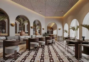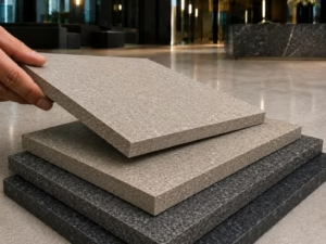
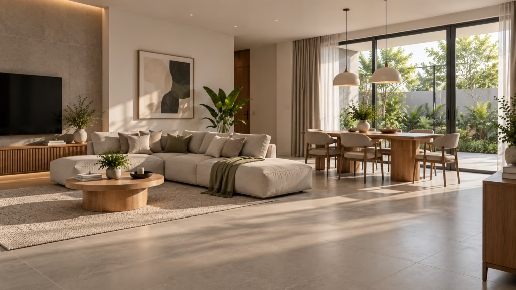
Tile tone is the lightness or darkness of a tile, and it shapes how a room feels before anyone notices the pattern or the format. Lighter tones can make a space feel more open and airy, while deeper tones can give it a more enclosed and grounded feel. Neither is the correct choice on its own, since the room’s size, natural light and daily use all come into it. Check the product data sheet for the relevant specification before you commit to a tone across a whole floor.
What Tile Tone Actually Means
Tone describes how light or dark a tile reads, separately from its colour family or its finish. A beige and a grey can share the same tonal weight, and the same design is often produced in more than one tone across a range.
• Tone is not colour. Two tiles can both be described as grey while sitting at opposite ends of the tonal scale.
• Tone is not finish. A matte and a polished tile may share a tone but reflect light very differently, which is covered separately in the guide to tile finishes.
• Tone is not undertone. Warm and cool undertones sit within any tone, and they are what make a light tile read as creamy or crisp.
• Tone carries furthest. Tone often has a strong visual impact across a full floor, before pattern or format becomes apparent.
Plain-language definitions of the terms used here sit in the tilepedia glossary, and current colour direction is covered in the 2026 tile colour palettes guide.
How Tone Changes the Feel of a Room
People commonly describe lighter rooms as feeling more open and brighter, and darker rooms as feeling more enclosed and restful. These are general impressions rather than fixed outcomes, and they depend heavily on the light a room receives and how it is used.
• Perceived space. Lighter tones can reflect more available light, which is why they are often considered for compact rooms.
• Perceived calm. Deeper tones generally create a stronger, more enclosed visual effect, which can suit rooms intended for winding down.
• Time of day. A tone that feels bright in Malaysia’s strong midday light can read very differently under evening lighting alone.
• Contrast with fittings. White sanitaryware, timber furniture and metal fixtures all read more strongly against a deep floor than a pale one.
Because the effect depends so much on the room, viewing a sample in the actual space, at more than one time of day, is generally more reliable than judging tone from a showroom display. The Kimgres visualiser is a quick way to preview combinations before committing.
Light and Dark Tones at a Glance
The table below summarises common differences between lighter and deeper tones.These are general patterns rather than rules, and the result would depend on the product and the room.
| Factor | Lighter and warmer tones | Deeper and cooler tones |
| Perceived space | Reads more open and airy | Reads more enclosed and grounded |
| Light behaviour | Generally reflects more light | Generally creates a deeper visual effect |
| Contrast with fittings | Softer, more continuous | Stronger, more defined |
| Visible marks | Dust and lint less obvious | Dust, lint and watermarks more obvious |
| Commonly considered for | Compact rooms and spaces with limited natural light | Larger rooms and spaces with stronger natural light |
Kimgres produces ranges across both ends of this scale, from lighter warm neutrals such as Arani Mist to deeper greys such as Cenno Twilight and Cenno Grey.
Bathrooms
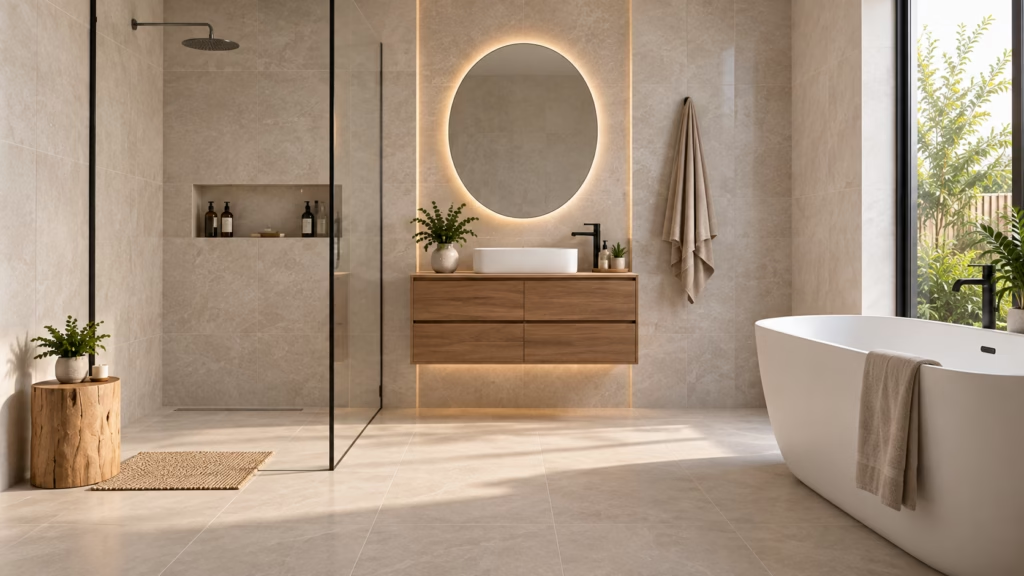
• Compact bathrooms. Lighter tones on both floor and wall generally help a small bathroom read as larger, particularly where there is little or no natural light.
• Deeper schemes. A darker bathroom can create a more enclosed, spa-like feel, but works best with sufficient lighting and contrast.
• Wet areas first. Whatever the tone, the surface characteristics matter more here. Slip resistance is measured by several different test methods, and one rating should not be assumed to replace another, as set out in the anti-slip tile ratings guide. Slip resistance should be assessed against the relevant product data, applicable standards and project requirements.
• Watermarks. Deeper tones can make water spotting and soap residue more noticeable, particularly in frequently cleaned areas.
Kitchens
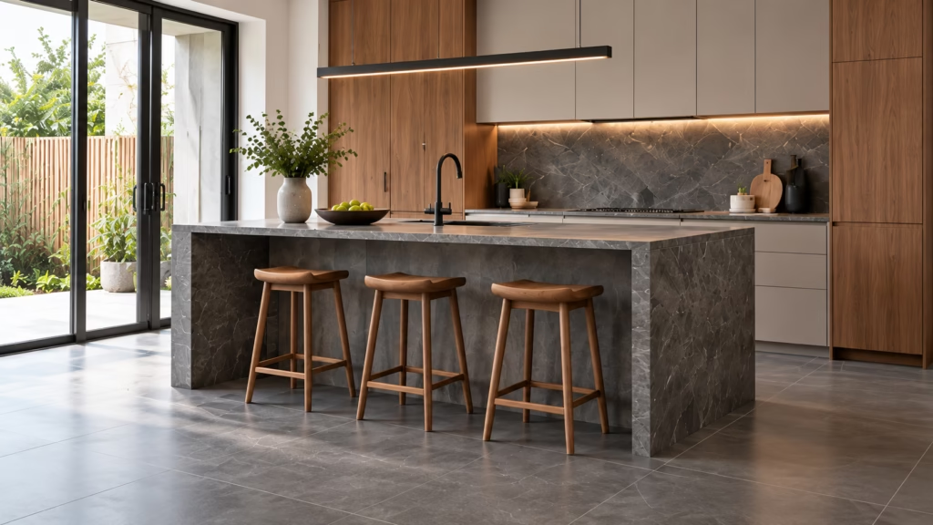
• Working with cabinetry. A floor close in tone to the cabinets can create a more continuous look; a darker floor can give the cabinetry more visual definition.
• Wet and dry zones. Many households run one tone across both zones for continuity, then vary the surface characteristics to suit the wet kitchen’s conditions.
• Backsplash tone. Lighter backsplashes can make a working area feel brighter, while deeper tones may make some splash marks less noticeable but can make grease more visible under direct light.
• What to review first. Tone is a design decision, while suitability for a kitchen floor is a technical one — the two are best settled together rather than in sequence.
Living and Dining Areas
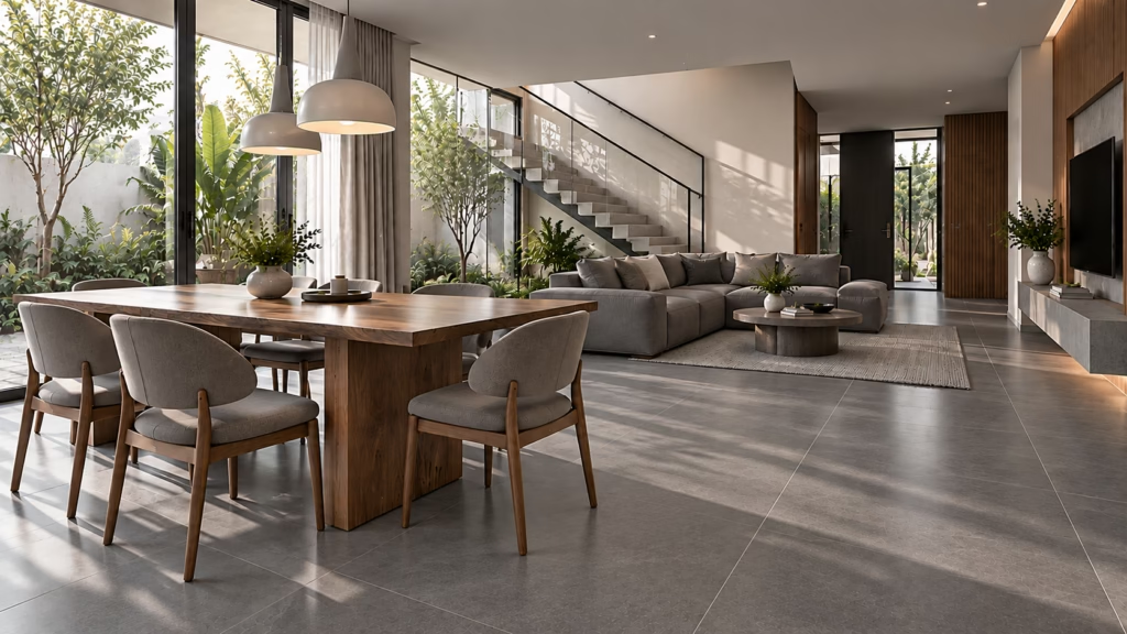
• Scale. A tone that felt subtle on a sample can feel considerably heavier once spread across an open-plan living and dining space.
• Natural light. Rooms with stronger natural light can generally accommodate deeper tones more easily than rooms lit mainly by artificial lighting.
• Open-plan continuity. Running one tone across living, dining and circulation areas generally makes the whole space read as larger than dividing it by tone.
• Grey as a middle ground. Mid-tones remain a common choice where neither extreme suits, and the warmth of grey tiles is one reason they sit so comfortably in Malaysian interiors.
Where a compact living area is the concern, layout and format work alongside tone, as covered in the guide to tile layouts for small spaces.
Bedrooms and Quieter Rooms
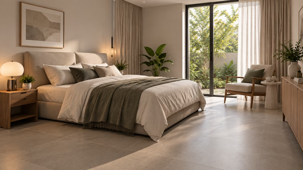
• Softer contrast. Many people prefer less contrast between floor, walls and bedding in a room intended for rest.
• Bedside lighting. Rooms lit mainly by lamps show tone differently again, since the light falls unevenly rather than filling the room.
• Tile type still matters. Tone does not determine suitability — the room-by-room guidance on tile types for each room covers what is commonly reviewed alongside it.
The Practical Trade-Offs: Marks, Dust and Cleaning
• Deeper tones. Tend to show dust, lint, footprints and dried water marks more readily, particularly in a polished finish.
• Lighter tones. Tend to show spills, scuffs and grout soiling more readily, especially in entry areas and around wet zones.
• Mid-tones. Often considered a practical middle ground, as different marks may be less visually prominent than on very light or very dark surfaces.
• Grout as part of the decision. Grout colour is commonly selected against the cleaning routine as much as the tile, and the tile grout guide sets out how the types compare.
• Cleaning method. Requirements can vary by product and finish, so the manufacturer’s recommended cleaning method would generally be followed rather than a general rule.
Mixing Tones Without the Space Feeling Disjointed
• Change tone at a threshold. Changing tone at a doorway or natural transition can make the change feel more intentional.
• Keep undertones consistent. Mixing warm and cool undertones can make a scheme feel visually inconsistent.
• Let one tone lead. Using a dominant tone for larger areas and a secondary tone for feature surfaces can help create a more cohesive scheme.
• Sample them together. Tones that work individually can clash side by side, so viewing them adjacent, under the actual lighting, is worth the time.
• Allow for variation. Some designs are supplied with noticeable piece-to-piece difference by intention, which is described by the shade variation classification on the product data sheet.
The suitable combination depends on the home’s light, layout and design intent. Check the product data sheet for the relevant specification, and confirm the final selection with your project consultant or relevant professional.
Frequently Asked Questions About Tile Tones
Do dark floor tiles really make a room look smaller?
They generally make a room read as more enclosed, though this depends heavily on the natural light available and the contrast with the walls. A deep floor paired with light walls often reads very differently from a deep floor with deep walls.
Which tone hides dirt best in a Malaysian home?
Mid-tones are often considered a practical option, since very light and very dark surfaces each show a different kind of mark. The cleaning routine and the amount of outdoor traffic entering the home usually matter more than the tone itself.
Can I use a light floor with dark walls, or the other way round?
Both are used, and the choice is generally a design preference. A lighter floor with deeper walls tends to keep a room feeling grounded without closing it in, while the reverse can feel heavier underfoot in a smaller space.
Does tile tone affect how hot a floor feels?
Indoors, any difference is generally minor and depends far more on the room’s ventilation, shading and air-conditioning than on the tile. For external areas exposed to direct sun, surface temperature would be reviewed alongside the product data.
Should the whole house use the same tile tone?
Not necessarily. Many homes run one tone through the main living areas for continuity and vary it in bathrooms or bedrooms. Keeping the undertones consistent generally matters more than keeping the tone identical.
Will a tone I like today still suit the room in ten years?
Neutral mid-tones are often chosen for their versatility, particularly across larger areas. For homes intended for resale or rental, neutral tones across larger areas may offer greater flexibility for future styling.
Conclusion
Tile tone shapes how a room feels before anyone registers its pattern or format. Lighter tones can make a space feel more open, while deeper tones can create a more enclosed feel. Mid-tones offer a visual middle ground and may make some everyday marks less noticeable. The room’s size, its natural light, and how the household actually uses it matter more than any general rule about which tone is better. Where more than one tone is used, consistent undertones and natural transitions can help create a cohesive scheme.
Whichever direction you take, review a sample in the actual room and check the product data sheet against the intended application before committing to a tone across a whole floor.
To review tile tones and their data, browse the Kimgres tile collection, or contact Kimgres for samples and product data.
Note: Tile suitability, durability, and slip resistance may vary depending on project conditions, installation methods, and usage. Final selection should be confirmed with your project consultant or relevant professional.